Which wall should be the accent wall?
Stand in the doorway and notice where your eyes land first. That wall is already the focal point, so color there reinforces something the room is doing anyway. In most rooms it is also the wall behind the main piece of furniture.
Good candidates are the wall behind a headboard, the wall behind the sofa or TV, a wall with a fireplace or built-in shelves, and the short end wall of a long, narrow room. A deeper color on that end wall makes it feel closer, which can make a corridor-like room feel better proportioned.
Walls that rarely work as accent walls
A wall broken up by a door and two windows has too little paint left to read as a feature. A wall you only see from the hallway does little for the room you are standing in. In open-plan spaces, avoid a wall that runs on with no corner to stop the color at; an accent needs a clean edge.
The wall opposite a big window can work, but it gets the most light, so the color will look lighter than the chip. Sample it there before committing.
Accent wall color ideas that work
An accent wall needs enough contrast with the other walls to look like a choice. The safest route is a deeper shade of the main wall color, two or three steps down the same color strip, so the two are related but clearly different.
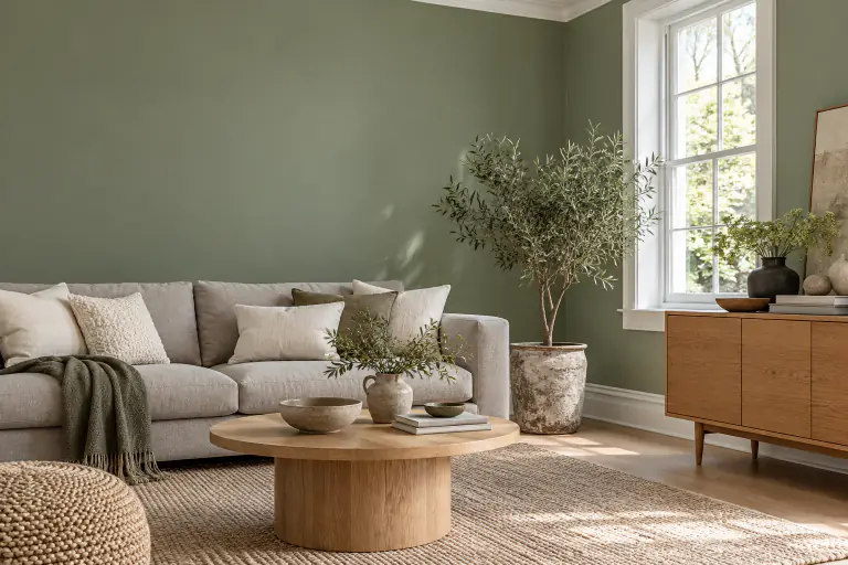
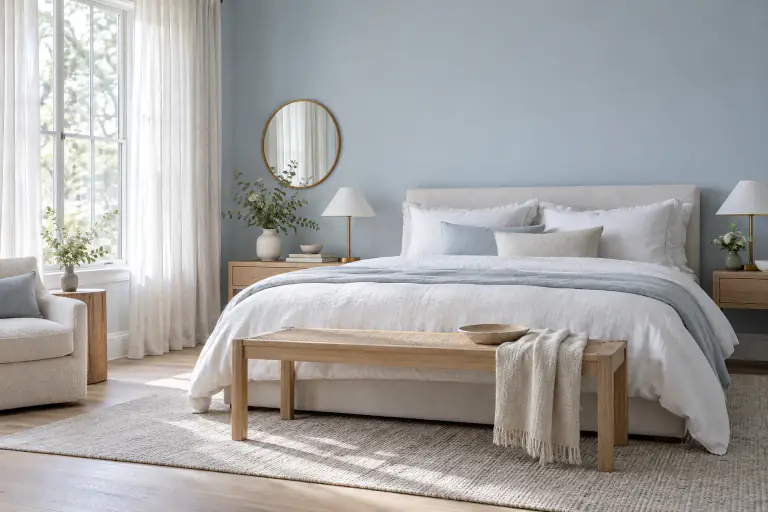
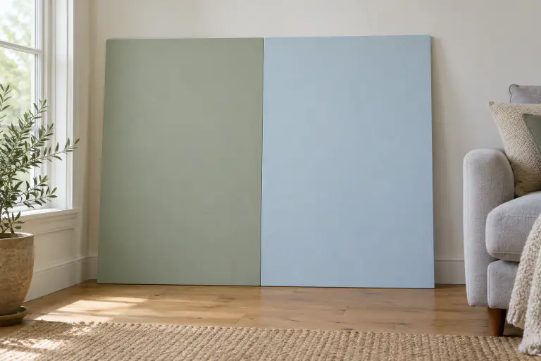
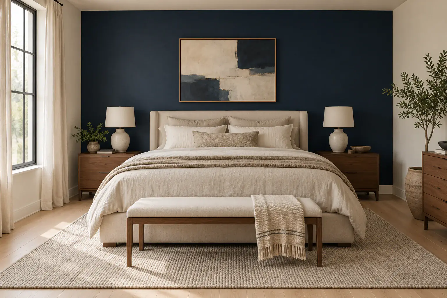
For a stronger statement, deep navy, charcoal and dark green are popular behind beds and sofas. A navy accent wall sits well with warm white walls, oak, brass and cognac leather. Softer options such as muted sage green or an earthy clay add color without the weight of a dark wall.
A dark accent wall looks best where it gets reasonable light, or in rooms you mostly use in the evening. Matte and eggshell finishes hide wall imperfections better than glossier ones, which matters more on a dark color.
Take the accent color from the room
If you are stuck, pull the color from something already in the room: a rug, a cushion, a painting. Choose a slightly duller, deeper version of it, since a wall-sized area of any color looks more intense than a small object in the same shade.
Preview the accent wall before you paint
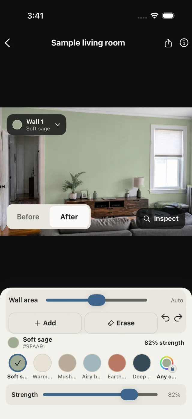
Accent walls are a good use for a photo preview because the question is how one wall looks against the rest. In PaintTry, select only the accent wall and try Deep navy, Soft sage or Earth clay from the palette. Tap another wall to add it and give the main walls their own color, so you see the two-tone room as a whole.
Save each version as a preview and flip between them. Try the same accent color on a different wall too; sometimes the wall you had in mind turns out to be the wrong one.
Test the accent color on the actual wall
Dark colors change more with light than pale ones. Put a large sample on the accent wall and look at it after dark with your lamps on as well as in daylight. Check the paint can as well: deep colors often need an extra coat, and some brands recommend a tinted primer underneath.
Common questions
Should an accent wall be lighter or darker than the other walls?
Usually darker. A darker wall reads as a deliberate feature, while a lighter accent in a darker room is harder to pull off. A brighter or more saturated color at a similar depth can also work.
Should the accent wall be behind the bed or facing it?
Behind the bed in most bedrooms. The headboard anchors the color and frames the bed, which is the focal point anyway. The wall facing the bed works if you want to look at the color from bed, but it is often broken up by doors or a dresser.