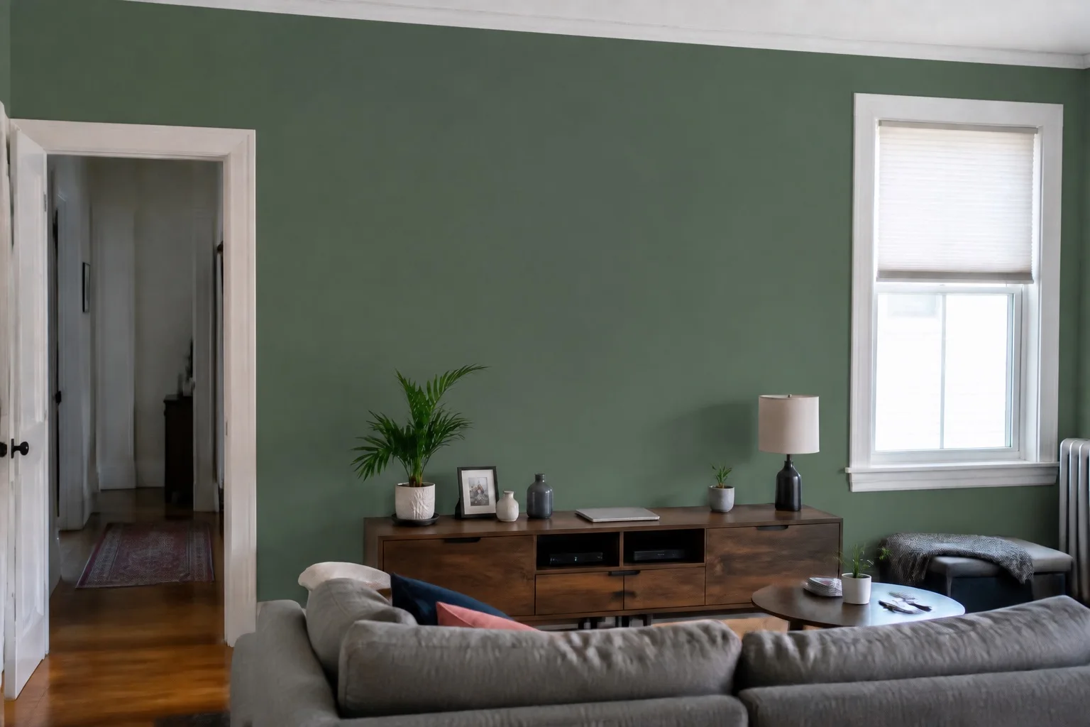
1. Start with what’s staying.
Look at the largest things you won’t be changing: flooring, a sofa, kitchen cabinets, curtains or a rug. A paint color has to work with those objects in the same room, so use them to narrow your starting palette.
Choose a small set of directions to compare. For example, try one light neutral, one muted color and one deeper option. These are starting points, not rules about which color belongs in which room.
2. Take a photo that shows the room honestly.
Stand far enough back to include the wall, its edges and some of the surrounding furniture. Keep the camera steady and use the lighting you normally have in the room. Avoid color filters or an exposure that turns a bright window and nearby wall into one white patch.
If a wall is mostly hidden behind furniture, choose another angle. A clear photo gives a paint visualizer more useful information and makes it easier for you to judge the result.
3. Compare paint colors in the same photo.
Open PaintTry, take or import your room photo, and tap the wall you want to change. Choose a palette color and compare it with the original. Keeping the same photo makes differences easier to see: the furniture, framing and lighting stay consistent.
Look at the whole room as well as the wall. Does the new color sit comfortably beside your floor and upholstery? Does it give you the quieter or bolder feeling you wanted? Save your strongest ideas rather than trying to settle on a precise paint match from a screen.
The curated palette is a starting point. Custom colors are available with PaintTry Pro. A digital color value is not a guarantee of a matching paint formula.
4. Check the edges before judging the color.
A patch of color on the window frame or sofa can make a preview feel wrong even when you like the shade. Use PaintTry’s Add and Erase brush tools to refine the selected wall around trim, furniture and other details. Adjust the paint strength if you need to compare a different level of coverage.
Check the original again. Shadows and texture should remain part of the room’s character. A preview is a planning aid; it cannot fully predict a different paint finish or how a surface will look after preparation.
5. Let a real sample make the final decision.
Take your shortlist to the paint shop and compare physical samples. Try the manufacturer’s sample product in your room, following its instructions. Check it in daylight and with your lamps on, and revisit it at different times of day.
Move a sample board beside the furnishings and onto different walls. A color you like next to the window may feel different in a shaded corner. Benjamin Moore’s paint sample guidance explains why viewing samples in your own lighting matters. Sherwin-Williams also recommends a physical chip, card or painted sample to confirm colors before purchase.
Once a sample works with the room’s real light and finishes, you have a stronger basis for buying the paint. Your photo preview got you to the shortlist; the room gets the final say.