Why a side-by-side paint color comparison helps
Colors are hard to judge alone. Look at a single warm white for a minute and your eye adjusts to it until it reads as plain white. Put a second white next to it and the first suddenly looks creamy, or pink, or slightly green. That relative shift is the information you want.
It is also why two colors that look almost identical on a fan deck can feel quite different on a wall. The comparison shows the undertone, and the undertone decides whether the color gets along with your floor and furniture.
Compare paint colors on screen first
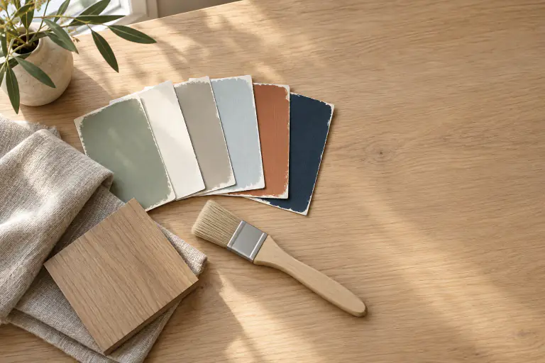
Paint brand websites let you put digital swatches next to each other, which is a fast way to spot undertones and to check how much lighter one color is than another. Most brands also publish a light reflectance value (LRV) on a 0 to 100 scale; the higher number reflects more light and will look lighter on the wall.
Swatches on a white web page tell you nothing about your room, though. They are good for trimming a long list; the choosing happens in the room.
Compare two paint colors in a photo of your room
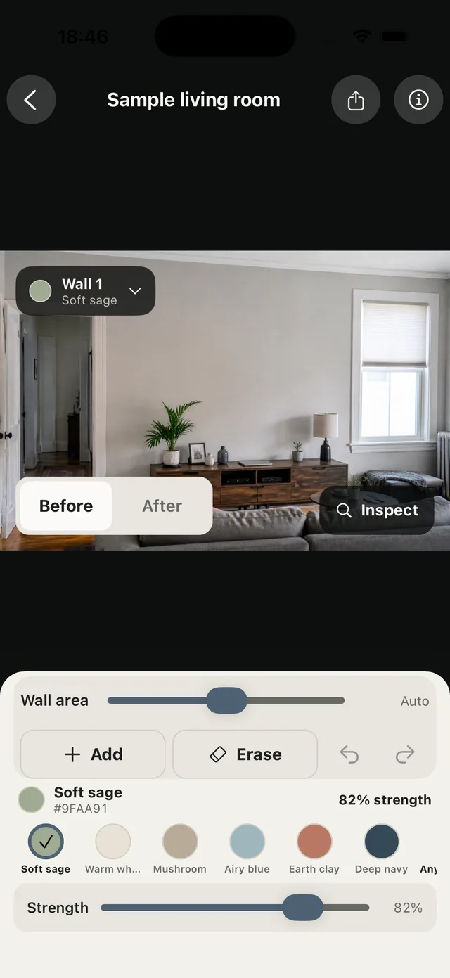
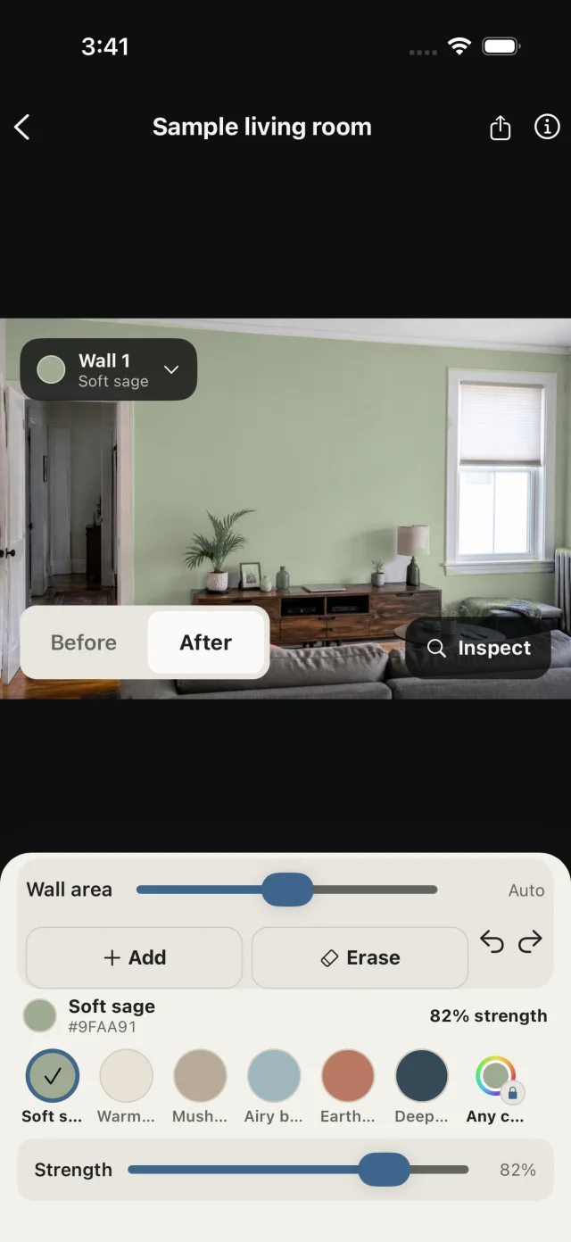
Recoloring one photo of your room keeps everything else constant: the same sofa, the same floor, the same afternoon light. In PaintTry, try the first color on the wall and save it as a preview. Switch to the second color and save that too. Flipping between saved previews in the room is a quick A/B test.
You can also paint two walls in one photo. Tap another wall to add it, give it the second color, and both colors sit in the same frame. If you’d rather see them as two pictures, share or export each preview and place them next to each other in your photo app.
Compare physical samples next to each other
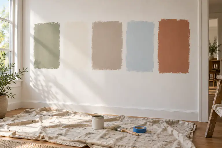
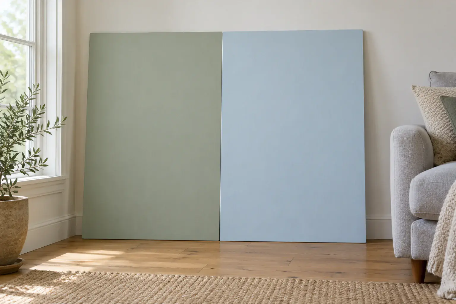
Once you are down to two or three, get real samples. Put them on the wall you plan to paint, with a little space between them so they don’t run together. Then hold them edge to edge for a moment: that direct contact shows the undertone difference most clearly.
Compare each sample against your trim as well. A warm white wall next to a stark white door frame can look dingy, while the same color next to an off-white trim looks deliberate.
What to look for when you compare
Check the undertone first (yellow, red, green or blue), then the depth. Look at both colors in the morning, mid-afternoon and in the evening with lamps on, because some colors hold steady and some swing a lot.
If you still can’t decide, pick the one that looks good in the room’s worst light. You will live with that light more often than you think.
Comparing colors across paint brands
Paint stores can mix one brand’s color in another brand’s paint, and several websites list near matches between brands. Formulas and bases differ, so a cross-brand match is close at best. Sample it before you buy a full gallon. PaintTry doesn’t match brand colors; it helps you see a color on your wall before you go shopping.
Common questions
What is the best way to compare two white paint colors?
Put both on large boards against the actual wall and hold a sheet of plain printer paper next to them. Against pure white, the undertones show up quickly. Check them again in the evening with your lamps on.
Can I compare paint colors in the same photo?
Yes. In PaintTry you can save a preview for each color in the same room photo and switch between them, or paint two walls different colors in one photo. Keeping the photo fixed means the color is the only thing that changes.