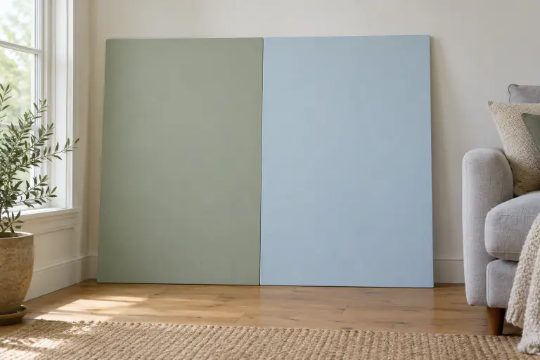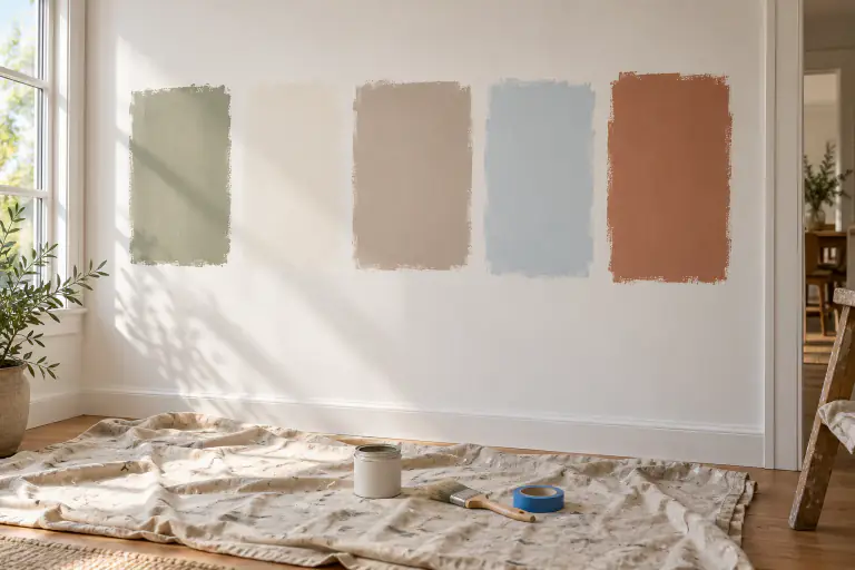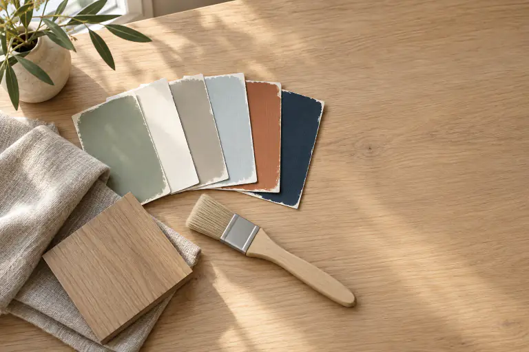
1. Take a photo of the wall you want to paint
Stand back far enough to get the whole wall, with a strip of ceiling and floor and whatever furniture sits in front of it. Face the wall as squarely as you can. A wall shot at a steep angle is harder to select cleanly and harder to judge afterwards.
Use the light you normally have when you use the room. If you mostly sit there in the evening, take a second photo with the lamps on. Turn off filters and portrait effects, and avoid shooting straight into a bright window, which washes out the wall beside it.
2. Open the photo in a paint visualizer app
Most paint color visualizers that accept your own photo work the same way: you upload or take a picture, then mark the area to recolor. Paint brands offer browser versions tied to their own color cards, which is handy if you already know the brand you want.
A phone app saves a step because the photo is already on the phone. In PaintTry you can take the picture inside the app or pick one from your library. Wall selection and recoloring happen on the device, so the photo isn’t uploaded for processing.
3. Select the wall and clean up the edges
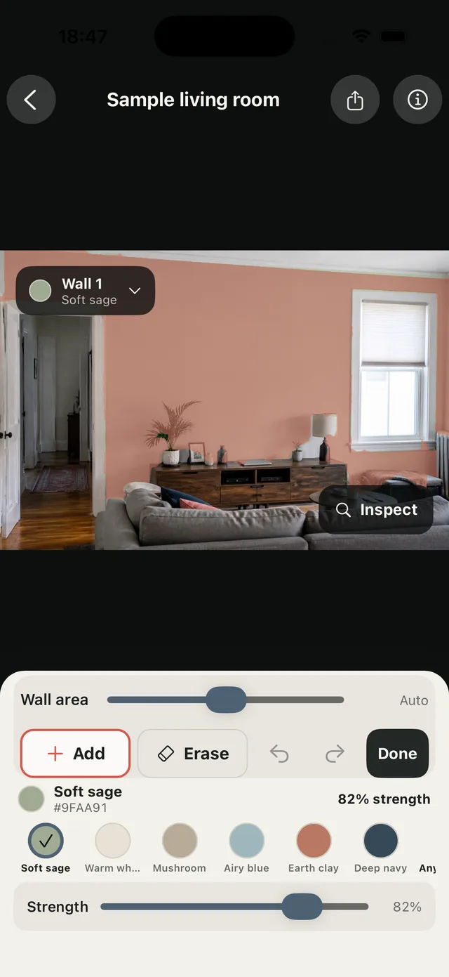
Tap the wall to select it. Automatic selection gives you a starting area, and the Wall area slider grows or shrinks it before you start brushing. Expect a few seconds of cleanup around window frames, picture frames, plants and the top of the sofa.
Use Add to brush color onto spots the selection missed and Erase to take it off trim or furniture. Undo and redo are there when a stroke goes wrong. Clean edges matter more than you’d think: a smear of green across a white window frame makes a good color look wrong.
4. Try a few colors and adjust the strength
PaintTry’s palette starts with six colors: Soft sage, Warm white, Mushroom, Airy blue, Earth clay and Deep navy. The strength slider sets how strongly the new color covers the wall, so a lower setting lets more of the existing tone show through. Shadows and texture from the photo stay in place either way.
With PaintTry Pro you can enter any color, which helps when you already have a particular paint chip in mind. Treat a hex value as an approximation, though. Screens and paint don’t produce color the same way, and a paint brand’s digital swatch is its own estimate too.
5. Compare before and after, then save the keepers
Switch between Before and After a few times. Your eye gets used to a new color within seconds, and flipping back to the original resets it. Save the versions you like as previews in the room so you can come back to them, and share one if someone else gets a vote.
Then narrow the list to two or three colors and buy physical samples. Our guide to comparing paint colors side by side covers the shortlist stage, and testing paint colors on walls covers the samples.
What a photo preview can and can’t tell you
A photo preview is good at answering “does this color work with my sofa and floor?” It is less reliable for the exact shade. Your phone adjusts white balance and exposure on its own, your screen has its own brightness and color settings, and real paint changes with sheen and with the surface underneath.
Use the preview to rule colors out quickly and to build a short list. Let a painted sample on the actual wall make the final call.
Common questions
Why does the preview look different from the paint chip?
The chip, the screen and your room each show the color under different light. A chip is printed under store lighting, and a preview is your camera’s version of your room’s light. Confirm the final pick with a painted sample on the wall.
What kind of photo works best for a paint visualizer?
A straight-on, evenly lit photo where the whole wall is visible. Avoid wide-angle distortion, deep shadows and bright windows in the middle of the frame. Furniture in front of the wall is fine, but it adds edge cleanup.